
In Development: Adventures in Film, Volume 37
I’m going to do something different with this week’s post. I’m skipping the usual rambling about the camera and/or film that tangentially relates to the images and will instead focus 100% on the images. I’m going to be talking through my feelings on the images: what I was thinking when I took the image, thoughts on the composition, reactions to the color, the theme or story underlying the image, etc. I’ll also point out whether I think any of the images are “final” or “shareable”. Obviously I’m sharing them all, so they’re all technically shareable…but as with 99% of my images they’re also (spoiler alert) garbage from a photographic perspective. In other words, if I was trying to prove to someone that I’m a “photographer” or “artist” I’d hide these photos rather than show them off.
To be clear, I don’t think a lot of these images are really that bad. It’s just that they’re also not very good. So many of my photos live in this “looks kinda cool and has some intriguing elements but it’s just not coming together in a powerful way” space. And that’s ok. The photographic legends still failed on 99% of their images (ok, maybe more like 98%). My hit rate is wwwwwaaaaayyyyy lower than them and my “hits” are garbage compared to what they produce…I’m not trying to compare anything I do to them, I promise…all I’m saying is that failure is a key part of the photographic process. With this week’s post, I’m going to be transparent about my failures in a way that may be of interest to other photographers out there.
My notes here are brief, stream of consciousness, and unedited. They’re not intended for publishing (neither are the photos), but that transparency is part of the point of this post.
All photos were taken with my Leica MP and Zeiss 35mm Biogon f/2.8 on Kodak Gold 200 shot at ~ISO 100 (generally overexposed a stop). They were developed and scanned by The FIND Lab, and I adjusted white balance, contrast, the tonal curve, and clarity to most of the images in Lightroom.
Ok, here we go!
1.

- wanted to use negative space here
- played on the line across the horizon: usually this element is used for mirroring, yet in this case it’s not a mirror…rather, it’s a weak attempt at contrast using color: warm browns of the fields contrasted with the blues in the sky…it fails in part because of how many clouds were in the sky
- those trees in the bottom right are super distracting and annoying
- I love the green line in the fields that bisect the bottom portion of the frame…nice complementary element
- the “subject”, if there is one, is the cluster of buildings in the bottom right. They have some leading lines that draw the eye towards them and they’re the only thing that isn’t just empty-ish space.
- the theme/story of this image is isolation, I suppose. I put the subject a little outside where the rule of thirds would dictate b/c I thought the extra empty space in the bulk of the frame would reinforce this theme.
- verdict: failure, but I certainly don’t hate this image. In fact, I kinda like it.
2.

- I mostly shot this to see how the film (it’s new to me — Kodak Gold 200) would handle the colors. It apparently loves green?
- Compositionally, this is nothing. Just a fun shot.
- verdict: failure, but fun to look at.
3.

- I wanted to do something with leading lines here…it kind of happened, but it’s also too busy for the leading lines to really work.
- plus — and this is the real failure of the image — there’s no subject! leading lines are great, but what am I leading the eye towards? Absolutely nothing. Say it again!
- I kinda like the colors here…the greens are (again) too powerful, but the muted tones otherwise are appropriate for the scene.
- verdict: failure, though the attempt at leading lines is good
4.

- Similar to photo 1 in terms of the idea behind the shot, but less organized
- I was trying to hit on the oasis element of the farmhouse and all that greenery around it. That works IMO, but the bottom 1/3 of the frame kinda ruins it. If there was more going on good in this frame maybe I’d crop it…
- The lines of the road are again really powerful, but they don’t support the subject in any meaningful way.
- verdict: failure
5.
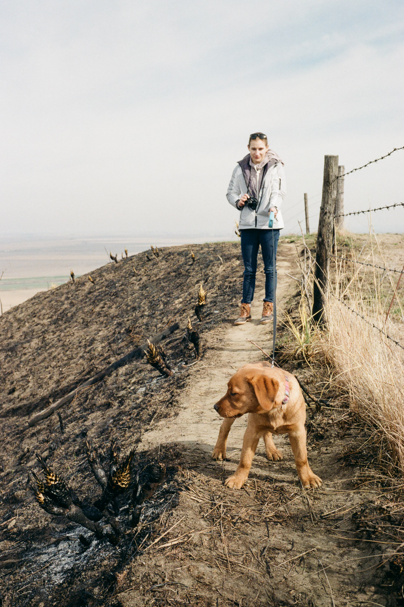
- just a fun snapshot of a cute puppo
- verdict: amazing shot b/c of the pup
6.

- this is an interesting one b/c of the curve in the road
- i like having the curve of the road hit in the bottom right corner of the frame
- there isn’t any unrealistic green in this frame, thank god (why does Kodak Gold have more vibrant greens than slide film?? wtf is going on with that film stock?)
- the only thing that can be considered a subject here is the silos, which is kind of on the rule of thirds intersection. the fact that they’re white kinda kills it, though. they don’t pop at all…which maybe is kind of ok b/c the whole palette of the image is so muted.
- verdict: failure, but something’s interesting about this image…i can’t put my finger on it, but i think the winding road is an important piece. I should re-visit this one more and see what I can learn from it.
7.

- see 4
- verdict: failure
8.
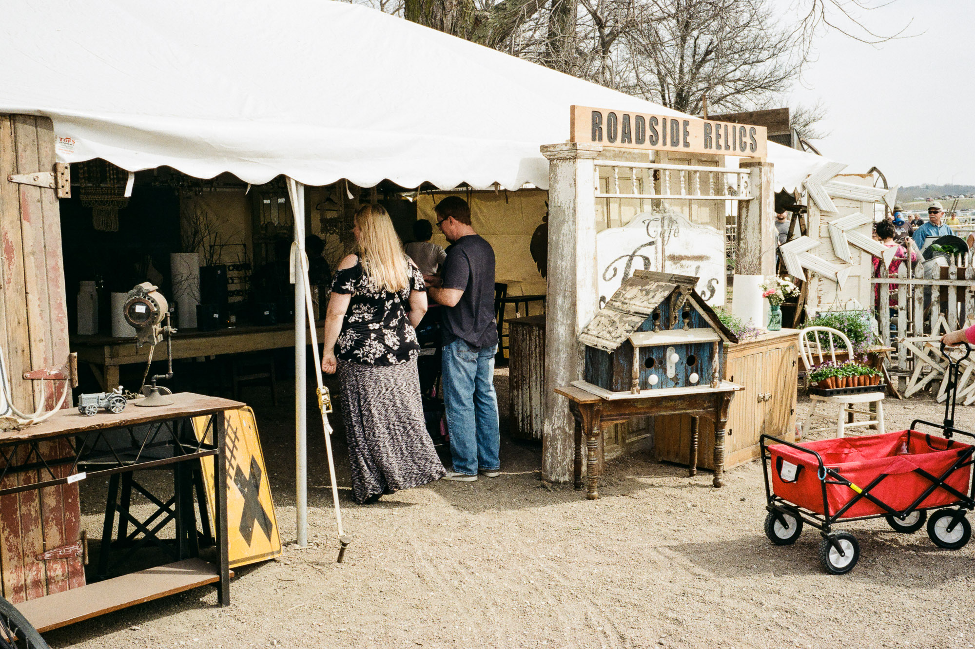
- the next set of photos is from some Omaha farm fair thing (can’t remember exactly what it was). they’re all just snapshots
- this would be a pretty decent snapshot/environment shot if not for that damn wagon. it’s so red and it just pops off the screen and pulls the eye to the completely wrong part of the image. why didn’t i frame that out?
- verdict: failure
9.
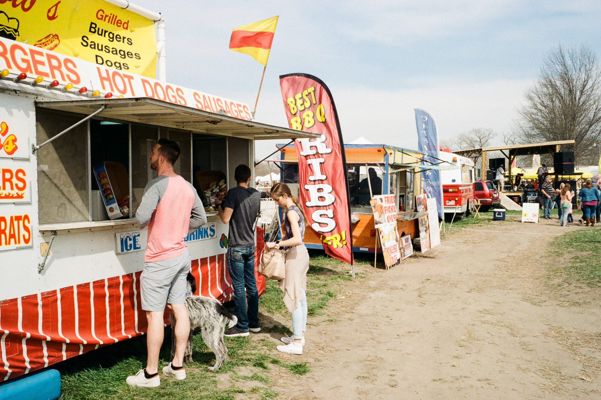
- the colors here are awesome! all those reds are wonderful, and the guy’s shirt complements them perfectly.
- compositionally, there’s just no subject/cohesion of the compositional elements to focus on the subject. i’d say the man ordering is the subject, but the BBQ sign draws the eye and the leading line of the road draws your eye away from him.
- verdict: failure, but with a cheeky crop it could be a useful image in a series to establish the scene
10.

- hah, this is a fun one
- the little kid in the blue shirt pops off the screen, which is important that he draws the eye first
- he’s looking at the little girl, who also has an interesting element to her in that she’s covering her eyes. this is where the eye probably goes next, and the interplay between the boy and girl is wonderful! there’s an element of mystery there: is the boy dancing? why is the girl covering her eyes?
- the eye probably completes the triangle (a good compositional element) by focusing on the mom. the pink of her shirt complements the pink of the bucket, and her arms/sticks create another triangle in her bubble-making process.
- the realization that she’s making bubbles might then draw the eye to the various bubbles that are sprinkled throughout the scene even though they don’t really stand out from the background. this helps complete the story/add some context to what the heck this group is doing here.
- the only thing that sucks about this photo is the background. it’s way too distracting.
- verdict: failure-ish? i wouldn’t mind sharing this, though, given all the good stuff going on. i just wouldn’t brag about it b/c of the distracting background.
11.

- nice snapshot, but that’s it
- i waited for like 5 minutes for the mamma horse to turn around so i didn’t have to shoot her ass hovering over her foal. she didn’t. thus i have a picture of a cute foal and a horse’s ass.
- verdict: failure
12.
- another environment shot that fails b/c there’s a distracting red element (red draws the eye more than any other color) in the corner. smh why don’t i frame those things out?
- verdict: failure
13.
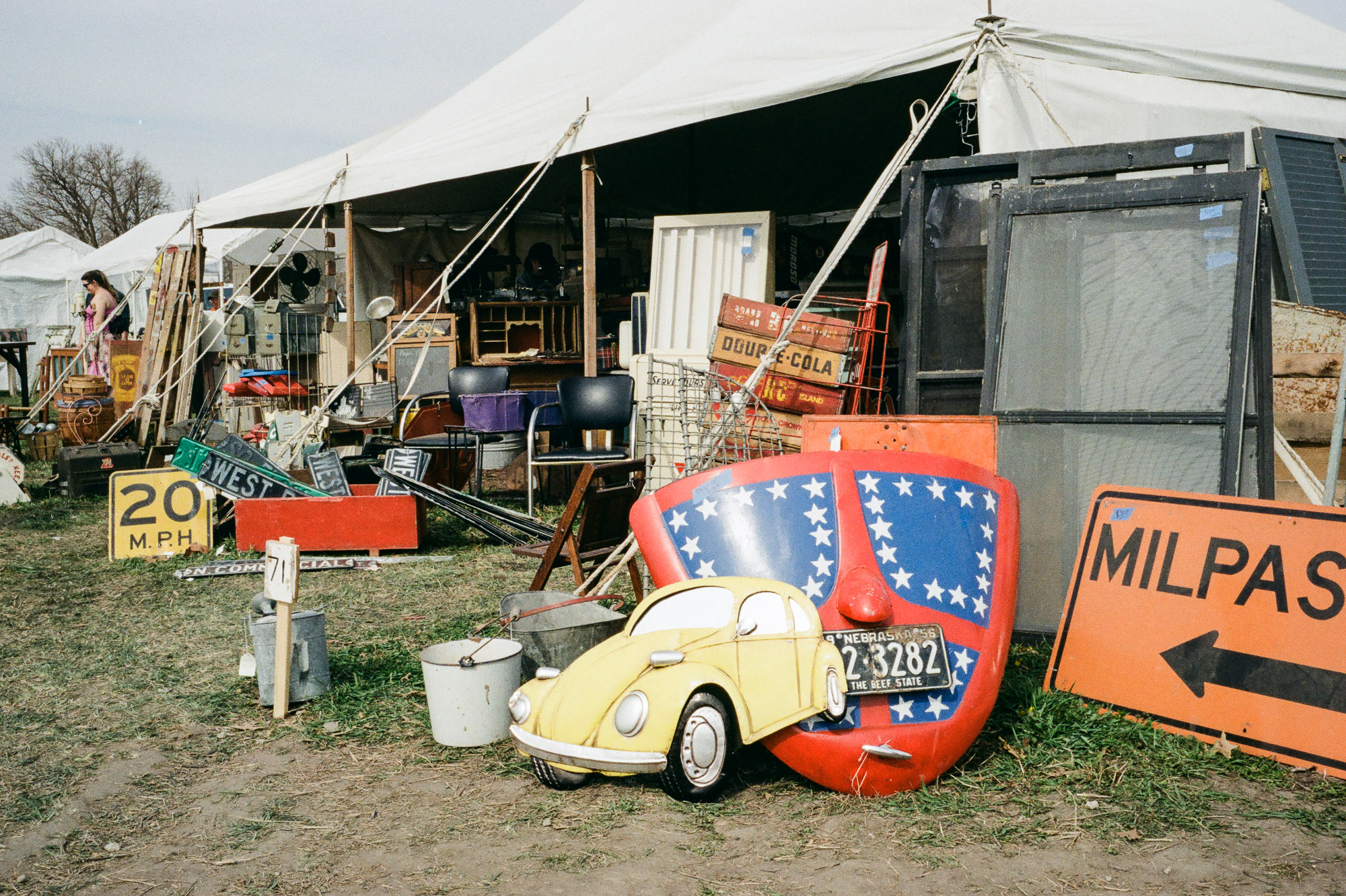
- this is an interesting one…
- it’s super busy, but it might be busy in a way that’s interesting and not just busy in a distracting/whatthehellamilookingat way…
- the yellow bug signthing is the subject
- it’s complemented by the yellow 20mph sign on the left part of the frame.
- the red next to the yellow sign would grab the eye next
- then the next red is the weird sign that’s behind the yellow bug sign, so maybe the eye goes there next?
- orange is close to red…so the next connection is the sign on the right side of the frame that says “milpas” and points back into the frame…
- and then maybe the eye starts to explore the back half of the image? there’s some orange behind that weird red sign, and behind that there’s some red/orange cola signs.
- this image has nothing but junk and nonsense in it, but it’s super interesting
- verdict: failure b/c there’s no theme/meaning to it, but compositionally i actually really like it (it just works with the color elements imo)
14.

- hah i just liked that sign
- verdict: failure
15.

- this weird horse statute was just about a block away from my apartment when i lived in omaha. i walked by it all the time but didn’t take many photos of it. i’m glad i at least took this one.
- i always thought it was so funny that there was this super bright and colorful horse outside a police station that was about as stereotypically boring of a building as there is. something about that contrast makes me chuckle.
- verdict: failure, but i’m glad i have this picture
16.

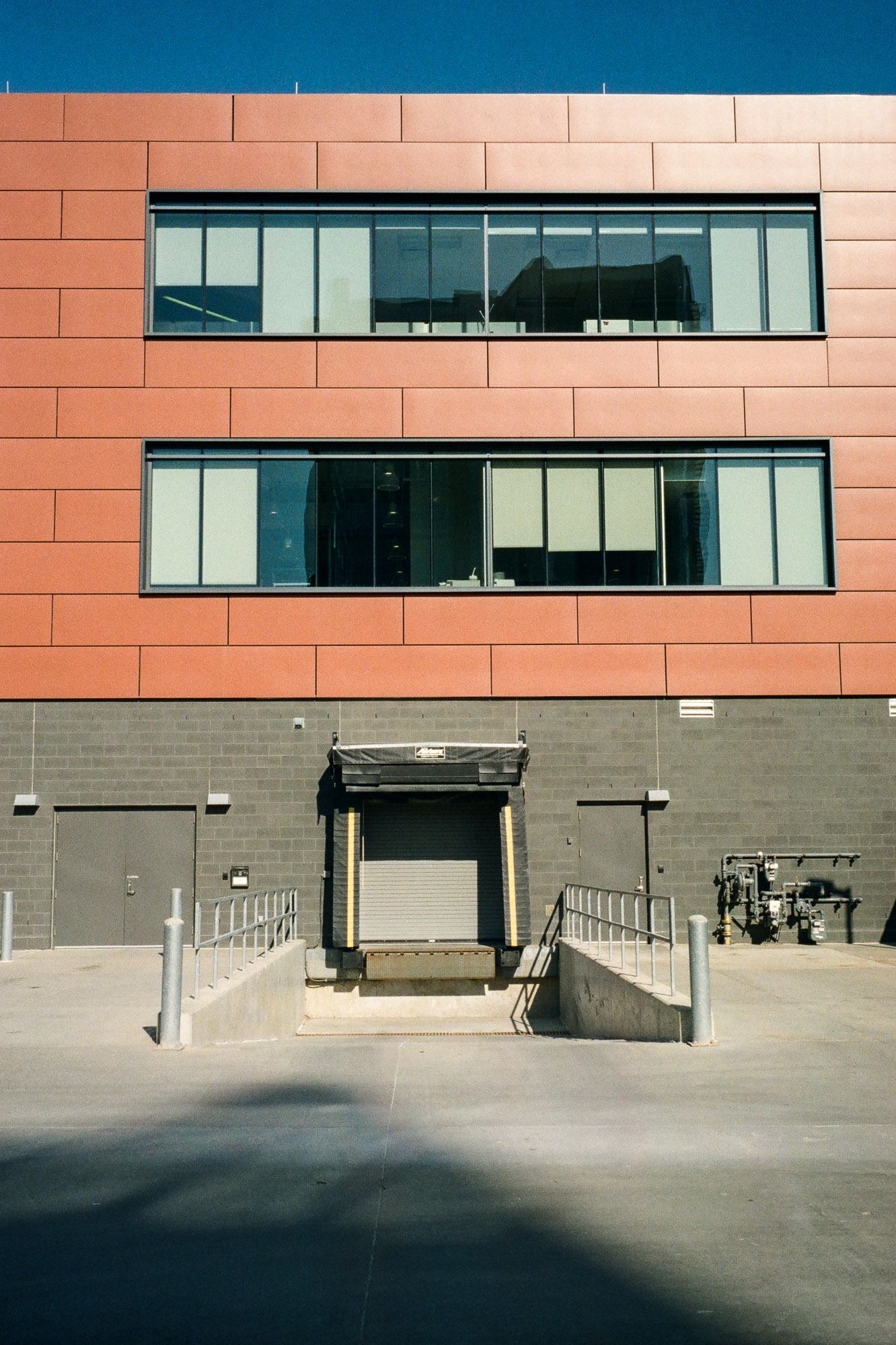
- ok, we have something here. there’s some nice color contrast between the sky and the other elements, and the blooms complement (in an ironic way) the building.
- the problem is that there’s no strong subject. the eye kinda floats around the scene, but there’s no purpose to the floating.
- verdict: failure, but this is a nice behind the scenes or environmental piece that could complement a series to help establish time and space. i mean, those blooms are quite pretty…
17.

- this is a tricky one
- i like the elements of the photo, but something’s not fitting for me 100%
- there’s a triangular element between the door (the black outline and the white inside creates a contrast that draws the eye initially), the covered window (which has similar elements to the door), and the railing knob (which also has a contrast element with the white concrete behind it). then the railing draws the eye back in.
- so compositionally, this isn’t that bad
- the colors are pleasant too
- again, though, there’s no subject or meaning to this image. it has no story.
- verdict: i like looking at this photo, and it reminds me of all the things in cities we usually forget about, but it’s a failure of an image.
18, 19, 20.


- same thing as above. i like these images and they’re fun to look at and the light is enjoyable…
- verdict: …but they’re still failures
21.

- ok, now we’re talking…
- out of the entire roll of film, there are maybe two-three images that have potential as a “final” shot
- and there are only two that have a real story to them…or a theme…i don’t know how to describe it exactly
- this is one of them! i was struck by the resiliency of the weed to grow in this grimy crack in asphalt right in front of a rusty door in a cement wall…
- i saw this and immediately thought “a tree grows in brooklyn” -> “a weed grows in omaha”
- which i thought was a hilarious encapsulation of the the coastal elitism vs. the flyover states. the theme is the same (resiliency, grit, etc.), yet on the coasts there’s this burden to make the smallest of victories seem magnificent (an amazing tree growing out of concrete in the greatest city in the world) whereas in the midwest the humility is almost excessive (their victories are reluctantly shared, and only expressed as happy accidents…such as a weed happening to sprout from an oily crack).
- to be clear, i expect absolutely nobody who views this image to pick up on any of those thoughts. those are just the things that ran through my mind when i saw that weed and decided to take a picture of it.
- this is something i struggle with…like, i see this image and i think it’s one of my strongest images because i have all of this background themes floating around in my mind…yet nobody who sees this image is going to think all that…
- verdict: …so it’s a failure? i think? this might be one that i’m too close to… i think if this was shared on instagram it’d 100% be a failure. if it was shared in an art gallery where people have the expectation of reflecting on the art it might have a chance. but this is one where i’m happy to say “eh, to hell with what other people think…i’d print that”.
22.

- i just wanted to take a picture of pretty spring flowers
- kodak gold actually pops those greens pretty well, huh?
- verdict: failure
23.
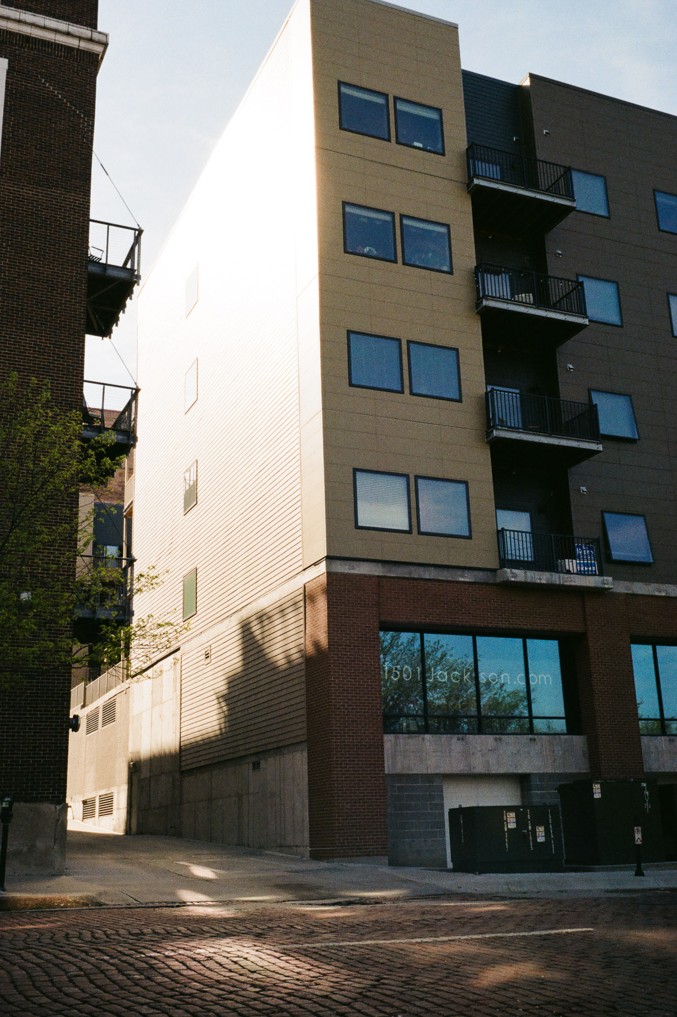
- i just took a photo of the building where i lived
- i like how the one window is open right in the middle of the frame
- verdict: failure (but it was always intended to be a failure…i just wanted a snapshot of my home)
24.

- i just wanted to play around with shooting wide open and getting a feel for the depth of field and how the film would handle overexposure
- i actually like this photo! it’s pretty to look at
- that said, using a shallow depth of field to create/isolate a subject is just lazy photography
- verdict: failure
25.
- this is a nice shot
- the diagonal shadows are pleasant and draw the eye into the frame
- the colors are just gorgeous in the early morning light
- i took this with a small aperture to increase the sun star effect in the reflection on the window…turned out pretty well
- verdict: there’s no subject/story, so it’s a failure. but i like it
26.
- hah, this is the sort of thing i love
- those colors, the contrast, the shadows…it’s awesome
- verdict: failure
27.
- just felt like taking a snapshot and seeing how the film would handle the scene
- see that vertical line on the left side of the frame? i think i need to get my leica fixed up…seems to have some shutter bounce at 1/1000 shutter speeds, sadly…
- verdict: failure
28.

- this is the other shot in the roll that has a story to it.
- there’s an obvious subject (the woman who’s hard at work at something)
- there’s a triangle between the woman, the street sign, and the stool in the bottom right.
- the stools then lead the eye back to the woman, so not only is there a triangle there’s a natural pattern for the eye to move
- the colors are also gorgeous
- the film handled the dynamic range pretty well. i wanted it high key-ish, and it did a decent job of not blowing out the bright sun on the streets while also keeping the woman well lit
- verdict: failure. even though there’s a story there and the composition works, the story doesn’t mean anything. there’s nothing here that illuminates deeper meaning or the human condition…it’s just a little sneak peek into this woman’s life. people may relate to it or find it enjoyable, but this image won’t change anything or anybody.
29.
- i just liked the reflections on the brick street
- verdict: failure
30.

- more spring flowers!
- verdict: failure
31.
- it’s weird looking at film images a couple years later…i’m like 70% sure that i took this image in milwaukee when christina and i visited there when she was looking for a job. but i can’t place it, and it’s entirely possible this was in omaha somewhere (the prior and next images are both shot in omaha, i’m pretty sure…).
- verdict: failure
32.

- i love these images
- verdict: failure
33.

- just a fun snapshot of a cool building
- i always loved the green ivy with the red brick with the black/white sign. when i walked by there were some pretty clouds and i liked how the crack in the asphalt led to the door (where i had my reflection), so i snapped a shot
- verdict: failure
34.

- i always loved this corridor of trees/sidewalk/lights, yet i could never shoot it well. i think maybe i needed a subject closer? or maybe a longer focal length…?
- verdict: failure
35-36.


- this awesome building was a half block away from me and i constantly shot it simply because i loved it
- verdict: failure, but man am i glad i took so many pictures of this building. sometimes i go back to thinking my photography should just be 100% about my own enjoyment and memories…and in those emotional states these images are successes.
37.

- i needed to finish this roll of film and just liked the morning light and the diagonal line of the light post and how it led to the cool color contrast of the building/sky
- fun image, i think
- i can’t decide if i should flip it across the y axis or not. most viewers think left to right, so that suggests that flipping it would be good. but the fact that it’s counter to the normal left-to-right pattern is kind of fun. i think if there was a purpose behind the image that complemented the right-to-left pattern (e.g., the subject was rebellious or counter-culture) it’d work. but…
- verdict: …it’s a failure. fun image, but there’s nothing there.

I was hoping we would end on a high note with a successful verdict! I really enjoyed this approach and I can’t wait to read the next one.
LikeLiked by 1 person
Thanks! Haha, I was hoping for that too…maybe next time!
LikeLiked by 1 person
Hi Kyle
Don´t be so hard on yourself. As you said in the foreword, photography in also about failure. That´s absolutley fine.
Henri Cartier – Bresson once said “Your first 10.000 photographs are your worst.”
I´m always happy when there is a least one print-worthy pic on a film.
Most it is 😉 . I´m now back into anaolg photograph for about eight or nine years. And I tend to think and analyse less and less about rules of a good picture, but I also often don´t take the shot, cause I clearly know that something is missing in the frame.
The most important thing about photography is fun and passion 🙂
My favorites from this roll are
nr. 14: It says food and it´s funny to watch, reason enough to take a shot 😉
nr. 20: Cause it has a good story, it´s you searching for a nice shot. I really like that kind of story. To be honest I´ve seen worse pics at gallerys 😉
nr. 28: I like the whole setting of the pic.
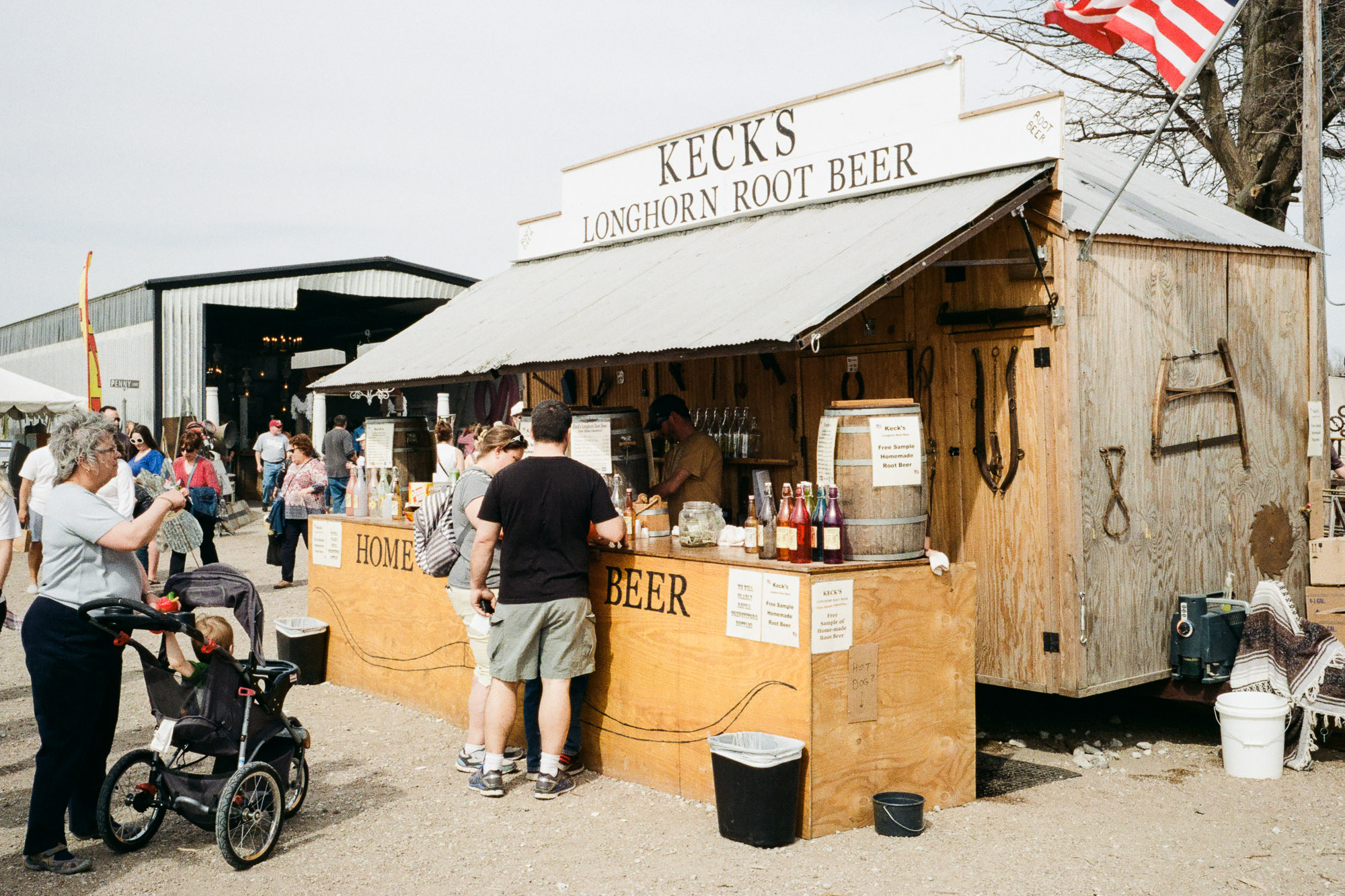
And I think all of the Omaha farm fair pics having potential.
As far as I can see, your should get closer to the subject. If you go closer, even if you crop parts of the woman who makes the soap bubbles, you´re getting more of the feeling that you´re with them, having fun, or buying a hotdog too.
I just say that, cause I often make the same failure when it comes to street photography.
Thanks for sharing!
Greetings from far away
Peter
LikeLiked by 1 person