
VSCO Film 02 Fuji Superia 100 Review
Introduction
This post is part of a series I’m working on in which I review in detail the look of VSCO Film presets. I have used presets quite a bit throughout my years as a photographer, and when considering buying a new set I often found myself frustrated with other reviews that I felt didn’t go into enough detail about the practical effects of the presets. Hopefully this series proves useful to others who find themselves in a similar position to me. I’m also using this series as an opportunity to hone my understanding of the editing tools at my disposal to manipulate contrast and color to produce a desired look. I hope you enjoy, and feel free to leave comments with questions and/or suggestions!
Background on the Film
Fuji Superia is a consumer-grade C–41 color film that has been produced in a variety of ISOs and formats over the years: ISO 100, 200, 400, 800, and 1600 across 35mm and 120/220 medium format. As of 2018, it is only offered in ISO 200, 400, 800, and 1600 in the 35mm format. Fuji states the following about the Superia 200 film:
Designed for flexibility and ease of use, SUPERIA 200 works equally well outdoors in daylight or indoors with flash. Enhanced color reproduction, sharpness, and smooth, fine grain.
Fuji also describes the colors as being accurate, yet vivid across the entire spectrum, “including vibrant reds, blues and yellows”. This is a curious description, as from what I’ve read from those that have actually used the film Fuji Superia’s most distinctive colors are greens and blues (this is also reinforced by the forthcoming analysis of the VSCO Film preset). Personally, I’ve never shot any of the Fuji Superia films so I don’t have any firsthand experience with them. I have shot Fuji Reala in medium format, however, which is generally considered the predecessor to Fuji Superia and really enjoyed the rendering of the greens, reds, and blues.
General Notes on the Preset
Throughout this analysis, we’ll be using the following photo as a sample image. First, I’ll show the RAW photo straight out of the camera side-by-side with the end result. Then, we’ll step through some of the components of the preset to see how the preset manipulates the RAW photo to yield the final result.


From a contrast perspective, what jumps out to me the most when applying the preset is the appearance of blown highlights and more contrast/less smooth transitions from shadows to highlights. Compared to the raw image, more density is concentrated in the shadows and highlights.
As far as the colors go, there are some noticeable color shifts in the greens. Specifically, they take on a more teal color and in the highlights they lose a lot of their yellowish warmth.
Now, let’s dive into each of the components of the preset to see how they affect the image. We’ll start with the camera profile.
Profile
The profile used for all of the Fuji Superia 100 variants is Fuji Superia 100 F.
Applying the Fuji Superia 100 F profile alone (without the remaining adjustments to the Basic, Tone Curve, Color, etc. settings) produces a significantly higher contrast image. A lot of density in the shadows is pushed to the far left of the histogram, which produces nearly-crushed blacks. Highlights are also pushed to the edge, but to a less significant extent compared to the shadows. They appear more blown out after applying the profile, but they don’t lose as much detail as the shadows.

Basic Edits
The basic edits primarily have the effect of undoing some of the harshness of the profile adjustments. The shadows and blacks are increased noticeably, which has the effect of “fading” the darker portions of the image slightly. A little of the shadow detail returns, and even though there’s not a whole lot of variation in the shadows, the density is more in the realm of “very dark grey” instead of “virtually black”. A similar mitigating effect occurs in the highlights, albeit to a lesser extent. The whites and highlights are dropped slightly, making them appear less blown out.
Overall, even though there’s less total contrast in the image, there’s still a lot of contrast between the darkest and lightest points. That is, the blacks aren’t quite as black and the whites aren’t quite as white, but between the two endpoints there’s still quite a bit of contrast. So the image still appears quite contrasty. Saturation is also dropped very slightly, but the effect is virtually insignificant.

Tone Curve
The RGB tone curve remains linear, but the starting point in the bottom left is raised slightly. This pronounces the fading of the shadows described in the Basic Edits section above.
On the color-specific tone curves, a slight S-curve is introduced for the red channel and there’s virtually no change on the green and blue channels. The most noticeable effect is that hints of red are removed from the shadows, which aids in the cooler and greener shadows.
In total, this creates dark shadows that are more dark grey than black and gives them a greenish-blue tint.

HSL/Color
There’s a lot going on here, so I’m going to break it into separate sections! First, though, here’s the before and after:

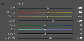
Hue
Magentas/Reds/Oranges/Yellows are all shifted to the next-in-line hue (i.e., reds are shifted away from magenta towards oranges, which are shifted towards yellows, etc.). The most significant effect (at least in my sample image) is in the green channel, however, which is shifted significantly away from yellow towards aqua. This strips warmth away from the greens.
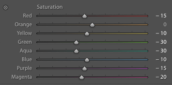
Saturation
Saturation is dropped pretty much across the board, with the most significant reductions in the green and aqua channels. So even though the greens become more pronounced in hue by stripping away yellow/warm elements, their saturation is reduced, eliminating some of the impact. To my eye, this has the net effect of making the green highlights (e.g., foliage in the sun) lose any warmth and appear washed out. I’m not really a fan. I like the effect in the shadows a bit better, as the saturation adjustment helps the greens from appearing too cartoon-y.
Luminance
Greens, Aquas, and Blues are all pushed significantly in luminance, which accentuates the effect I mentioned above in the Saturation section: the greens in the highlights look even more washed out. Pushing the lightness in the blues also washes out the sky, which is generally not an effect I’m looking for in a landscape image. Perhaps it’d work better in another context, however. Red is the only color that has its luminance dropped notably, which could offset some of the effect of reducing its saturation and make it pop a bit more. This doesn’t come through much in this image, however.

Detail
Not much going on here. There’s some minimal sharpening applied, but the setting of 25 is lower than the default setting of 40. This is common with the VSCO presets, as they attempt to avoid making the images look overly sharp. All other settings remain at their defaults.

Effects
A slight amount of grain is added with relatively modest size and roughness. This, combined with the minimal amount of sharpening yields an image that has more of a film “quality” or “character” to it. It doesn’t look quite as clean as most digital images we’re used to seeing, but the effect for this preset isn’t massive.
And that’s it! Here’s one last before-and-after now that all the components of the preset have been applied:
A Second Example
Before looking at the variants and wrapping up this post, let’s look at one more example photo. After analyzing the preset in detail for the image we’ve been using above, I searched through my library to try to find an image that I thought this preset would work well with: something with lots of rich greens and not a lot of midtone contrast. I also wanted to find an image with some more reds to see how the preset would do with isolating reds from greens. Here’s the before-and-after:


The major characteristics of the preset we noticed in the first example are present here as well. The shadows are faded (even more noticeable in this image), the warmth is eliminated from the greens, and the saturation is reduced. I like the result a little better in this image, as I think it does a good job of separating the red flowers from the greens. The warmth in the greens in the original image prevents the color contrast from popping quite as much. The fading of the shadows is too strong, though, and if I were editing this image myself I’d want to drop the blacks for the final image.
Variants
100 –
The “-” variants are usually very similar to the base versions with some of the most extreme characteristics backed off a touch. For Superia 100, the difference is quite subtle. The “-” version has less fading in the shadows and the shadow contrast is less harsh (i.e., the transition from dark shadows to midtones is smoother). This is achieved in the tone curve by boosting the shadows in the RGB channel slightly. There are no differences in any of the color settings, though the individual color tone curves vary slightly. It also doesn’t include a grain effect. Overall, I prefer the “-” variant to the base version.

100 +
The “+” and “++” variants usually represent slightly different interpretations of the films that can be produced by aging the films, exposing it differently than box speed, etc. The “+” version is noticeably punchier with the colors, puts more emphasis on magentas, reds, and oranges, and has deeper contrast in the shadows. The grain effect is also a bit more pronounced. Personally, this is my favorite of the Superia 100 versions, though I’d probably reduce or eliminate the grain effect for the majority of my final images.

100 ++
The “++” variant has a lot of fading in the shadows and manipulates the tone curves to produce a bluer hue, particularly in the shadows. The fading is far too significant for my taste, but otherwise I probably prefer the color profile of the “++” variant to the original.

Final Thoughts
Overall, I’m not a huge fan of this preset. I don’t think I’ve ever used the Superia 100 preset in a final image, though I have used others in the Superia line (e.g., I used a modification of the Superia 1600 ++ preset frequently for a while). The harsh transitions from the shadows through the midtones to the highlights really overwhelm my eye, particularly when there are lots of boundaries between shadows and highlights.
The best part of this preset is its rendering of greens, so it’s really a shame that the contrast issues make using this preset on foliage virtually impossible. I suppose if the subject was a dark, overcast forest where there wasn’t a mixing of light coming through the trees this preset could work well. But aside from weirdly specific niches like that, I just don’t envision myself yearning for the look that Superia 100 produces.
