In Development: Adventures in Film, Volume Three
My third roll of film picks up right where my second roll of film left off. The final frame in my second roll (HP5) was of an old greyhound bus depot in Five Points with a man on a bike riding past an alley and out of the frame. After making that image, I sat down in the shade of alley and loaded my very first roll of color film!
It was a fresh (unexpired, unlike the rolls I had been shooting so far) roll of Kodak Ektar 100. It’s a relatively new film that’s known for its vibrant colors and generous exposure latitude. There are two broad categories of color film: slide (or transparency) film and negative film. Generally speaking, slide film produces vibrant images but is very difficult to use due to its narrow exposure latitude (meaning that a slight underexposure or overexposure can ruin the image by making it far too dark or far too bright). Color negative film, on the other hand, generally produces softer colors and has very good exposure latitude. Kodak Ektar is a color negative film, but it’s often thought of as a hybrid between slide and negative film because while its colors have similar vibrancy to slide films it is far more forgiving of poor exposure than slide film.
I’m obviously very new to shooting film, and the concept of needing to decide days ahead of time whether I’m going to shoot color or black and white — and after that deciding what type of color or black and white film — is quite strange to me. I’m used to having virtually unlimited options at my disposal with regards to color, contrast, tonal range, etc. Now, when I pop a roll of film into my camera, I’m essentially committing to shooting a certain way until the roll is finished.
This may not seem like a big deal if you’re not used to shooting both color and black and white, but it’s actually quite important. Certain images work well in black and white but don’t work well in color. Others work well in color but not black and white. Very few work well in both forms. I think the reason for this is that there’s often a disconnect between the elements in the scene that you’d use to tell your photographic story with a black and white image than with a color image.
For example, if you’re shooting a black and white image, you’re likely going to be very in tune to the tonal contrast (the relationships between the whites, greys, and blacks) and the shapes of the elements in the scene (e.g., a road that weaves through the scene and helps control the viewer’s eye). You may create an image that works well with these elements. Once you add color, however, the color could completely overpower — at the very least neutralize — the contrast and shapes you worked so hard to use to tell your story. Maybe there’s a red fire hydrant in front of some trees that didn’t stand out in black and white due to the similar tones between the hydrant and the trees…but it absolutely pops in color and becomes a distracting element because there’s massive color contrast between the hydrant and the trees.
This brings me to the last shot of the previous roll and the first shot of this roll. They may appear similar at first glance, but they have very different stories. And the choice of black and white for the first image and color for the second image help tell their respective stories. In the black and white shot, the subject of the image is the man on his bike. In that shot, the backdrop of the bus station doesn’t overpower the subject. It’s just an interesting secondary element that helps set context for the viewer and has some leading lines that point towards the subject. If that image had been in shot in color, however, the vibrant oranges and reds of the bus station’s brick against the blue sky would immediately capture the viewer’s attention (since blue and orange are opposites on the color wheel, they have high color contrast and are eye-catching when placed next to each other). This would be the focal point of the image and the man on the bike would become a secondary element. I wanted the man on the bike to be the subject, and as a result making the image in black and white was perfect. For the shot that I took in color to start this roll, the man in the bike had already gone and the subject of the image was the bus station itself. In this context, the color contrast between the bus station and the sky make for an interesting picture. If this image had been shot in black and white, it would have felt flat and wouldn’t have held a viewer’s attention (unless, perhaps, an orange filter had been used which would have added contrast by lightening the brick and darkening the sky).
I want to explore one more avenue of thought before wrapping up this post. Shooting film has caused me to be much more reflective and thoughtful. This isn’t always reflected in these early rolls, as part of what I was doing was simply experimentation, but in general I’ve spent much more time framing my shots and ensuring that all the elements of the scene are adding something to the story I’m trying to tell. I’ve been doing this because every click of the shutter costs ~$3, which really adds up over the course of a month of continuous shooting… But while the initial reason for this cautiousness has been pragmatic, it’s had a corollary benefit of making my images stronger (in my opinion anyways).
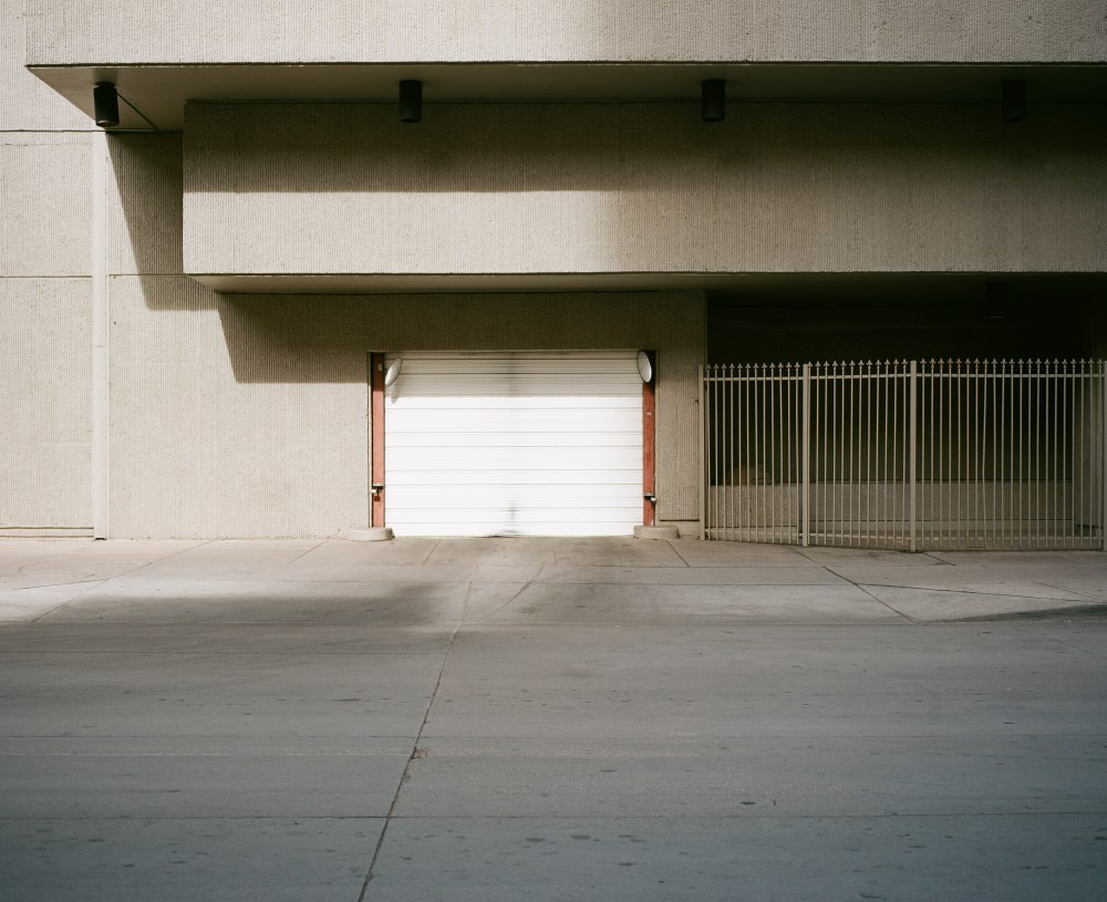
The fifth image below of the garage door is a great example of this. This is a very minimalist image in which virtually all of the elements of the image add something to the story (the crack in the street leads your eye to the door, the white of the door balances the dark shadows to the right of the door, the shadows in the upper left angle towards and thus lead your eye towards the door, etc.). What you don’t see in this image are any cars (this is a busy street, so I had to wait quite a while to get a car-less scene) or the rooftop garden. Had I been shooting digital, I probably would have snapped away the second the lighting on the door caught my eye. I would have included the garden and some cars in the image, which would have been distracting elements that would have ruined the continuity of the image. I think an important lesson here is that, regardless of whether you’re shooting film or digital, it’s useful to start with only your subject in your frame and add only the elements that add to the story. I’ve started to apply this philosophy when I’m shooting digitally, and I’m happy to say the result has been stronger digital images (and less time editing bad pictures!).
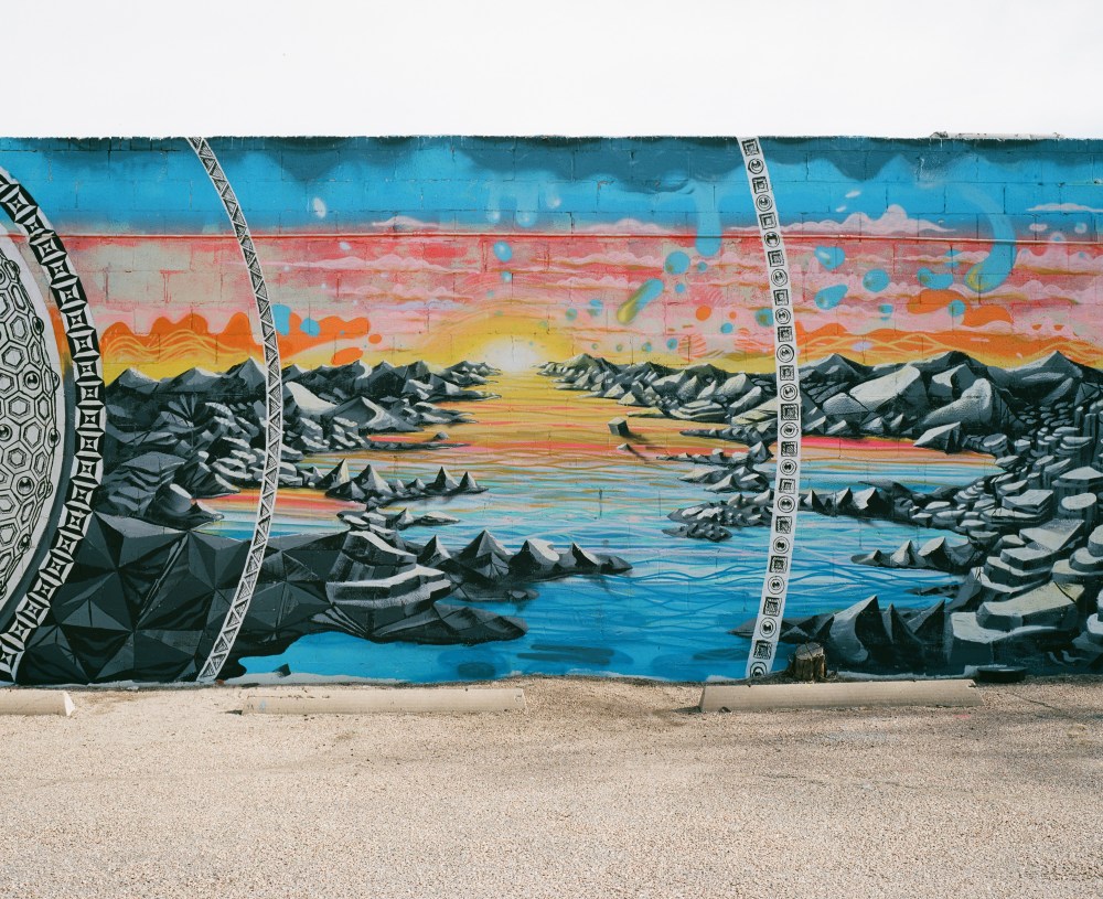
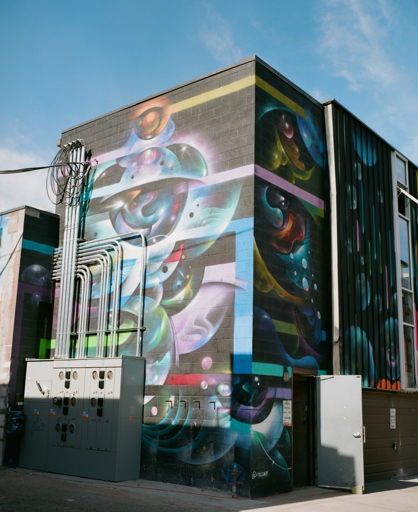
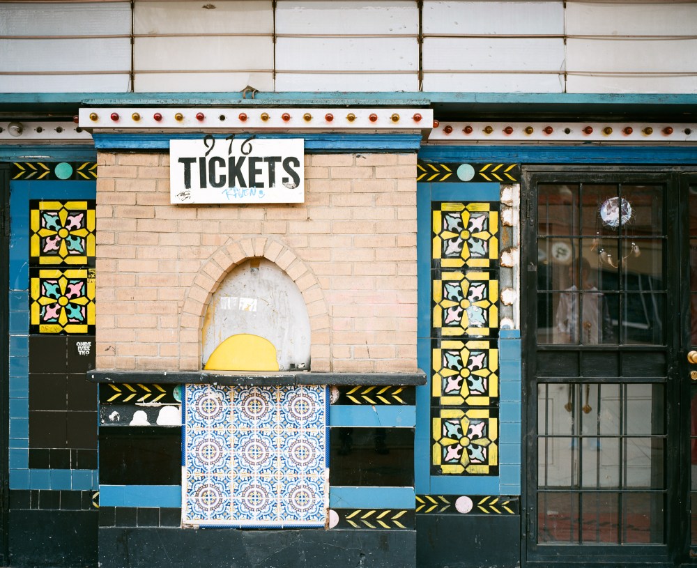
Ok, enough rambling. On to the pictures! All photos were shot on a Mamiya 7 II with the 80mm (39mm equivalent) lens on Kodak Ektar 100 shot at ISO 100. They were developed and scanned by 120Processing.com, and they were processed very minimally in Lightroom (mostly cleaning up dust spots and tweaking contrast). Enjoy!